Mundo Perreo
ART DIRECTION | BRANDING | EXPERIENTIAL
Mundo Perreo is an annual music festival held in Ciudad de Mexico, Mexico that brings together all lovers of the perreo lifestyle. This festival specifically features Latin American artists and spans across all subgenres of the electronica-driven perreo music.
OBJECTIVE
Create a brand identity for Mundo Perreo, a high-energy music festival aiming to celebrate the perreo music genre. This festival is brand new to the CDMX area, and should appeal to a younger, Spanish-speaking audience. The festival brand should be apparent throughout the entire experience: from the website to stage designs, to merch and promotions.
TARGET AUDIENCE
Music lovers from all walks of life with a special interest in EDM, Latin artists, and/or perreo music.
ART DIRECTION
Alfredo Palacios
DESIGN RESEARCH
Alfredo Palacios
BRAND POSITIONING
Alfredo Palacios
TRUST THE PROCESS
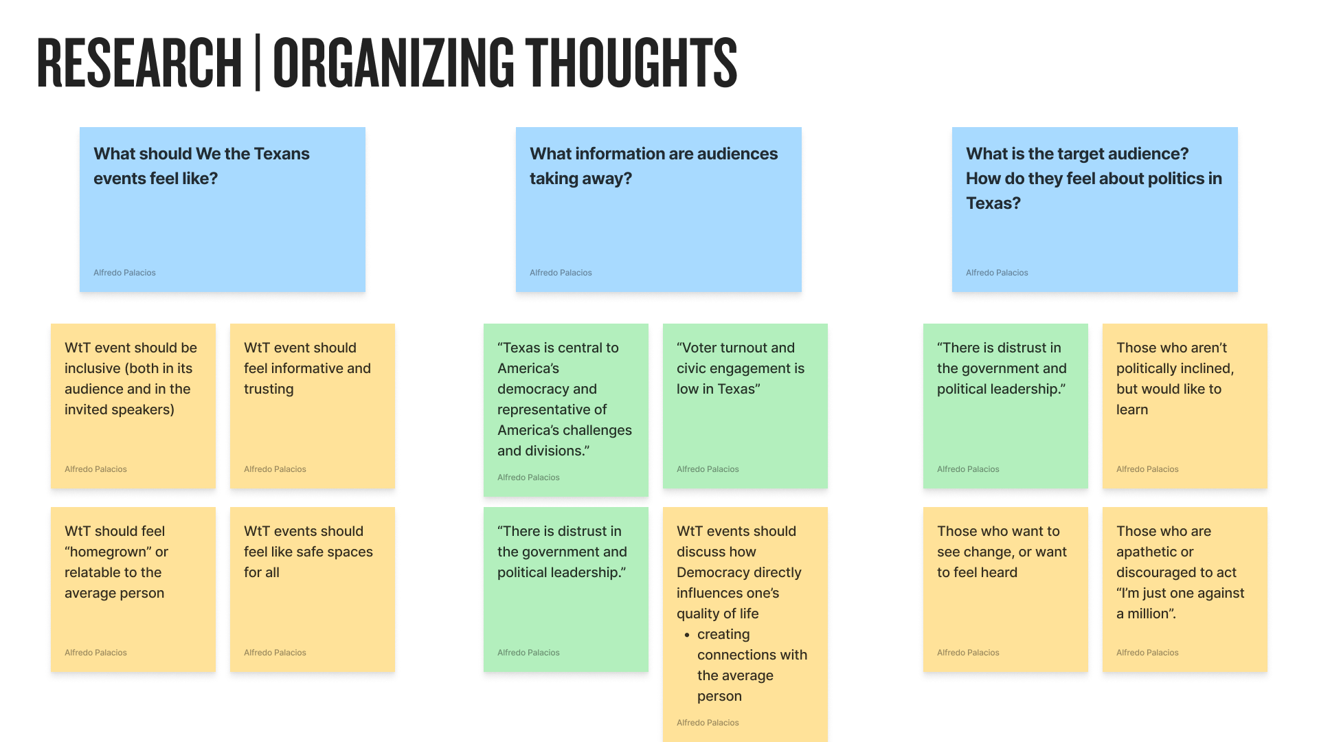
To kick off finding the visual identity to this initiative, I first needed to understand the intention and goal of every event under We the Texans:
What should a We the Texans event feel like?
What information are audiences taking away from these experiences?
Who is our target audience? How do they relate to politics?
I pulled key information from the initiative’s brief that aligned with these guiding questions, and created a wordlist to better facilitate a human-centered approach to the overall brand.
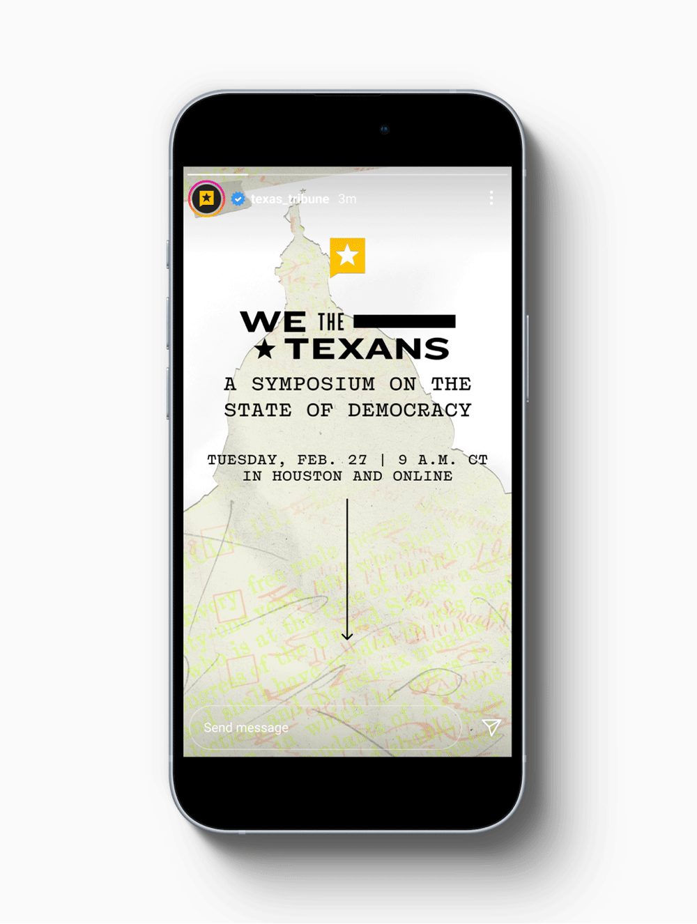

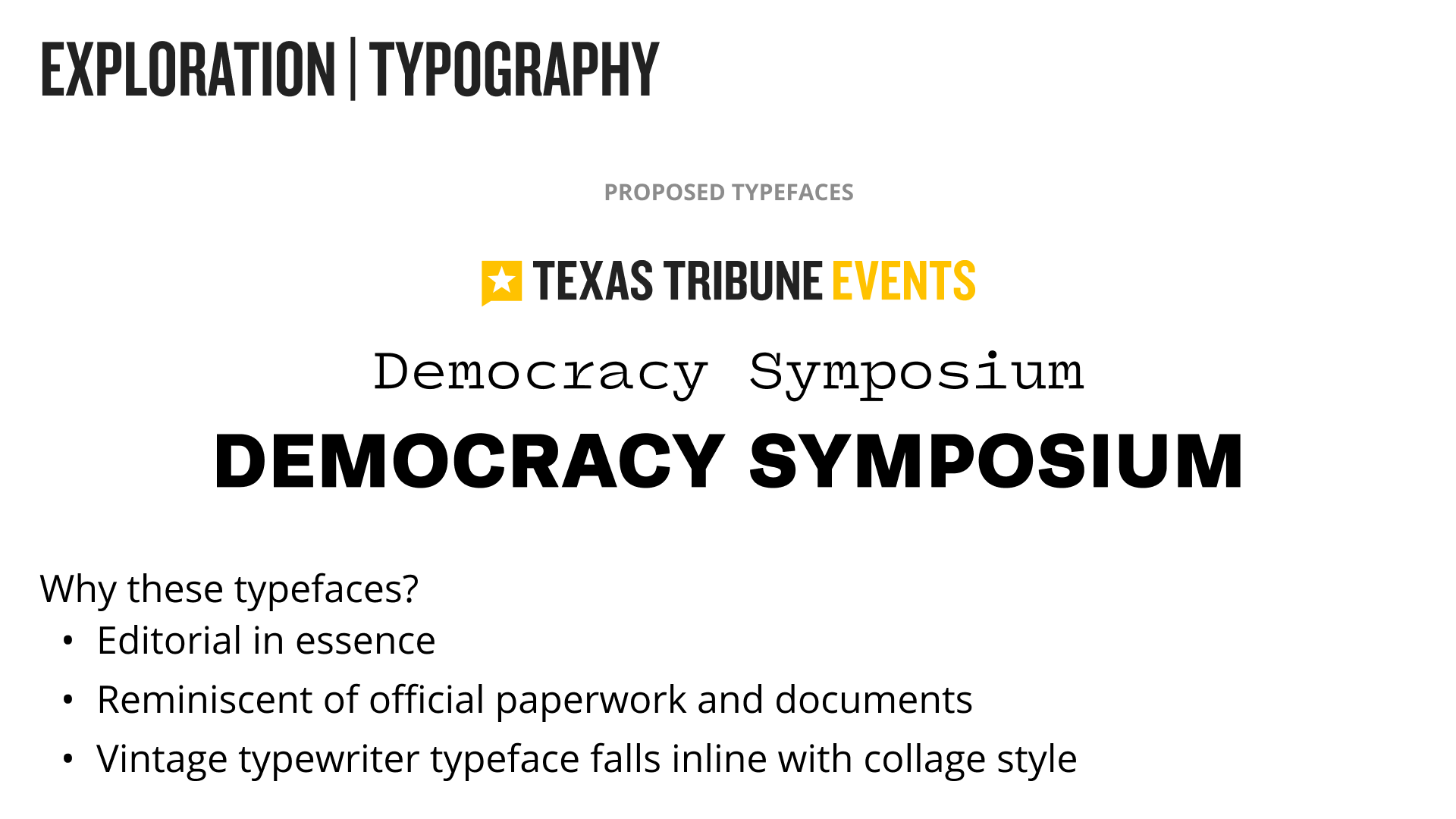
With these leading words in mind, visual exploration consisted of mood boarding, then formalizing guidelines on elements used for creative production:
High-contrast, black and white images at different angles
Scans of the Texas Constitution and other documents throughout early time periods
Incorporating details like textures, shadows and scribbles to push the human-centered theme of the initiative
These elements convey the concept of the symposium: our democracy and the way in which people interact and influence it.


CREATIVITY IN ACTION
The end result led to a unique and playful direction that piqued audience’s attention, effectively communicated the topic of each event, and helped convey the state of our democracy: a process that can be messy, but ultimately comes together to form something greater that effects each of us.


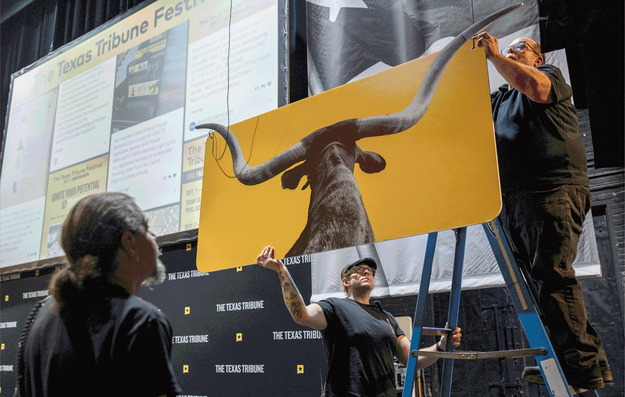
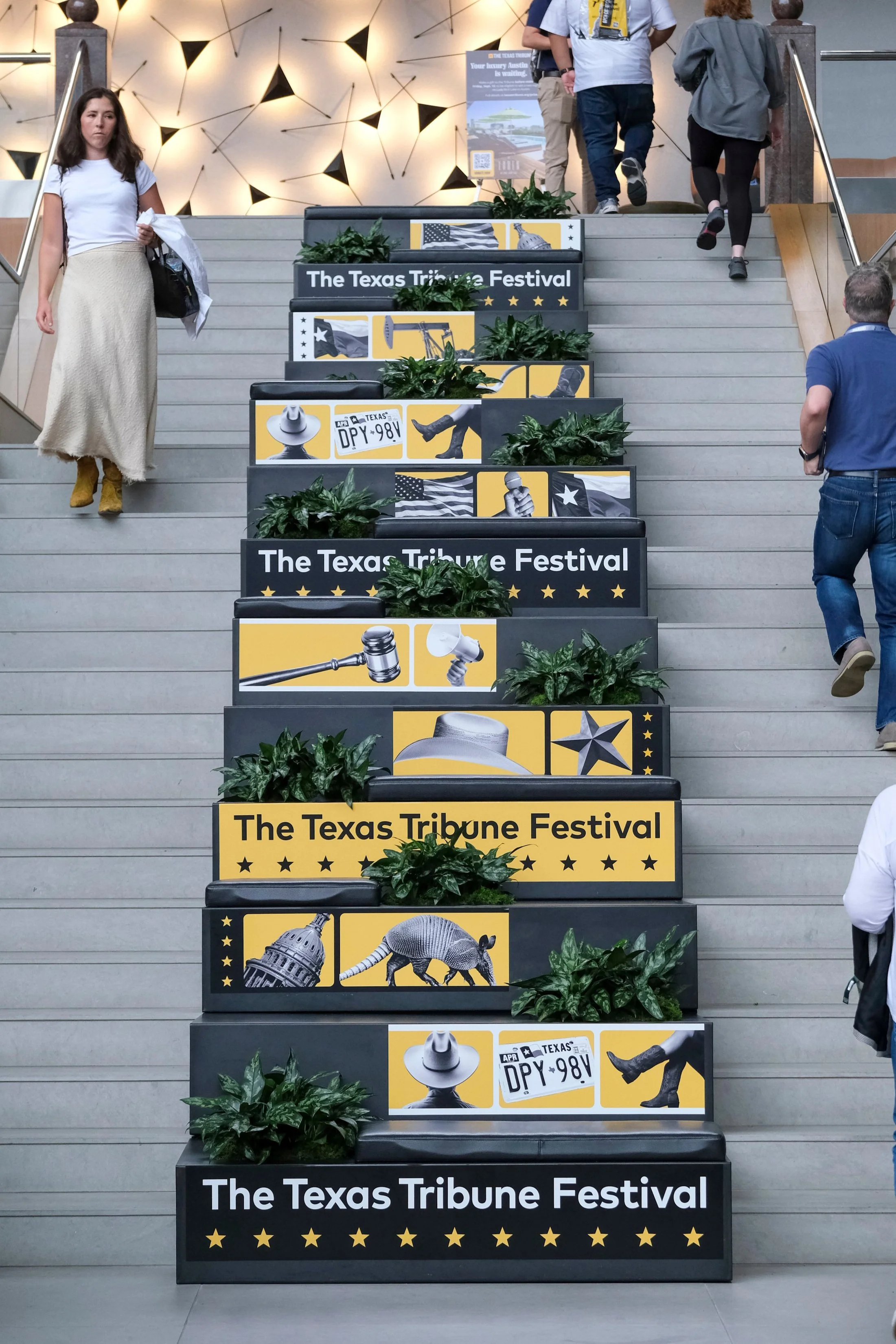
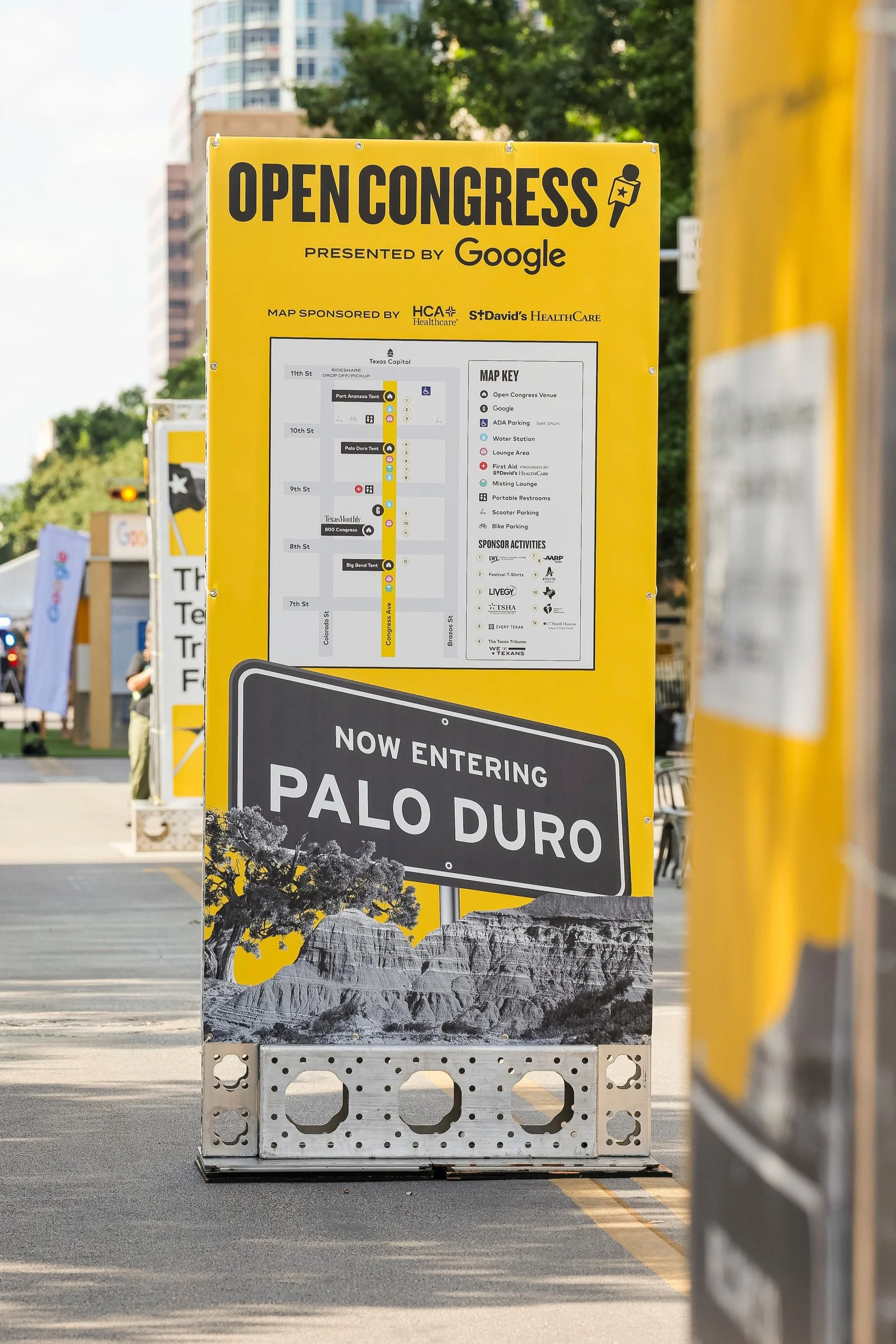
WHAT CHANGED THIS YEAR?
The Festival brand relies on the use of modular elements such as grids. By embracing the movement made within these grids, we were able to give a light refresh to our visual system.
We also experimented with collage compositions and new graphical elements and styles. This helped us establish a playful tone with our existing creative, and paved the way to push our festival brand into unique iterations.


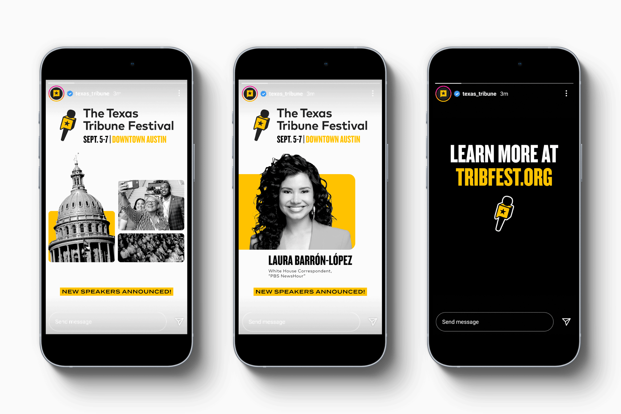
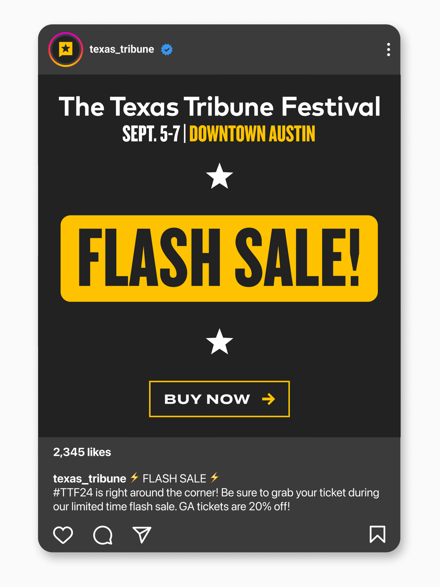
GETTING THE WORD OUT
By leading the production of promotional graphics this year, I was able to:
Templatize the creation of graphics by creating color styles to match each major campaign
Integrate new visual elements like stars and photo-backgrounds
Use GIFs/animation to display emphasis on important marketing pushes


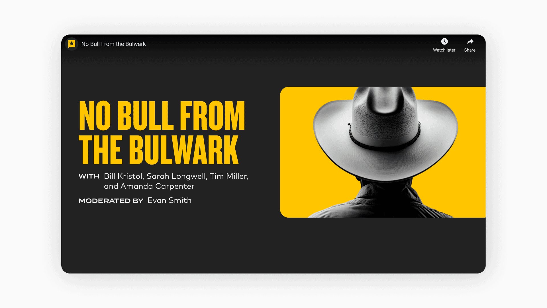
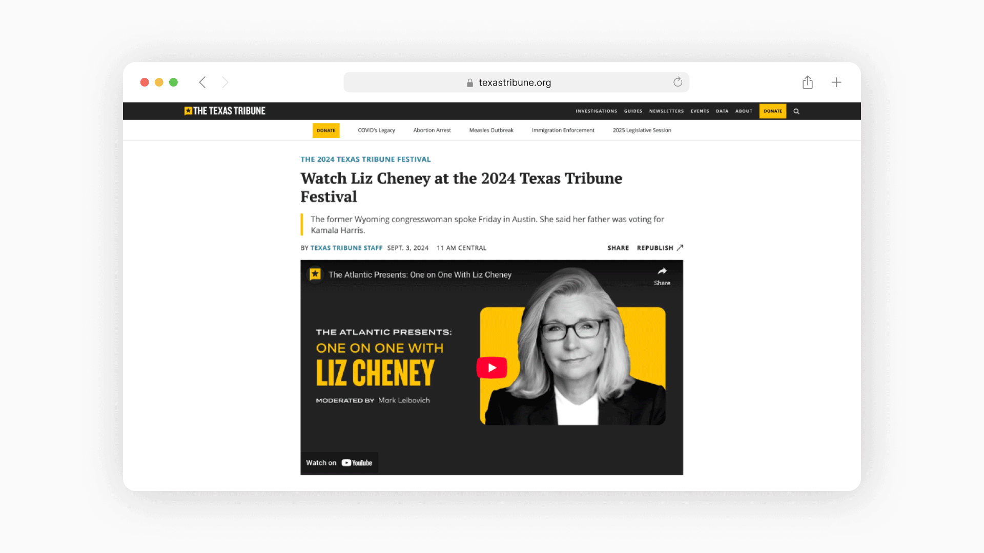
LIGHTS, CAMERA, ACTION
The Texas Tribune Festival is a recorded event. We livestream for attendees, and publish recorded sessions for viewing after.
Standard video graphics like title cards, lower thirds, and special call to actions are integrated to bridge the gap between in-person and digital experiences.
I templatized the title card design, allowing for ease of production. I also oversaw and assisted in the production of all video graphics.